 Marketing & SEO
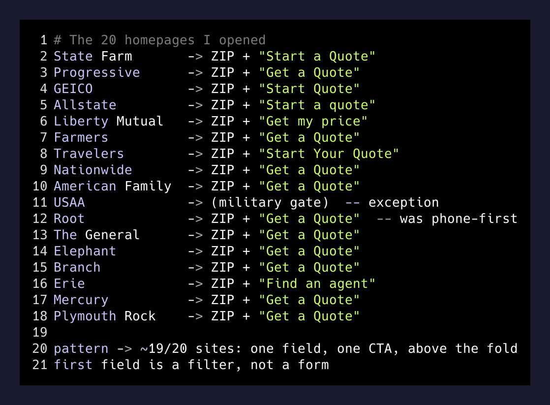
I spent an evening screenshotting the homepages of every major national auto insurance company. State Farm, Progressive, GEICO, Allstate, Liberty Mutual, Farmers, Travelers, Nationwide, American Family, USAA, plus a second tier of Root, Elephant, Branch, Erie, Mercury, Plymouth Rock, The General. Twenty brands, twenty homepages, twenty ways of saying “give us your business.”
Except they were not twenty ways. It was one way.
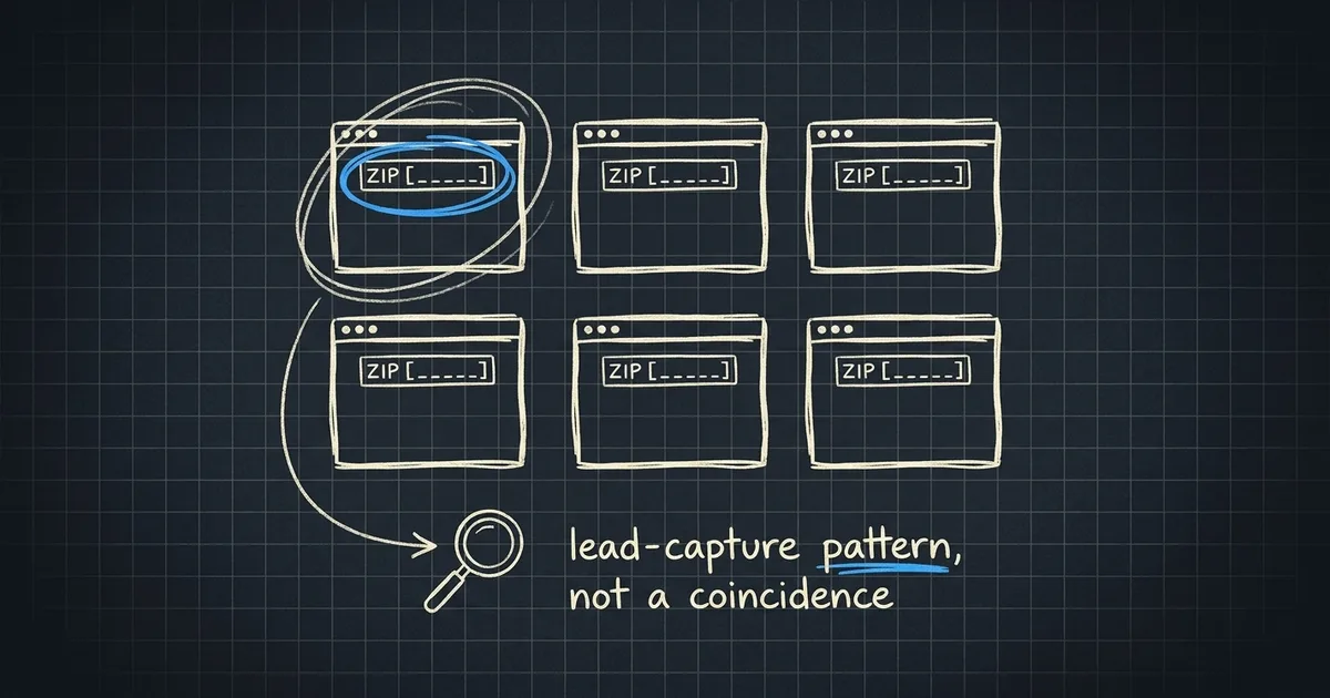
Every single one of them, above the fold, showed the same thing: a single input field labeled “ZIP Code” and one button. That’s it. Not “name, email, phone, DOB, vehicle year, drivers on policy, current coverage.” A five-digit box and a green rectangle.
That is not a coincidence. That is the most tested lead-capture pattern in American paid media, and once you see it you cannot stop seeing it.
 Home services do it. Solar does it. Utilities do it. Medicare supplement does it. It shows up on lawyer landing pages and mortgage refis and pest control. There is a reason.
Here is what a company is doing when they put a ZIP box on the homepage instead of a form.
The first field is a filter, not a form
The mistake most people make when they build a lead form is treating the first field as the beginning of the form. It is not. The first field is the decision to enter the form at all.
Nobody arriving at an insurance site is thinking about coverage limits and deductibles. They are thinking one question: “will this be cheaper than what I’m paying?” That is a low-commitment thought. A form that asks them to prove their identity before it will tell them a number is asking for a lot to answer a small question.
A ZIP code is the smallest possible commitment that still means anything. It is public information. It doesn’t feel like handing over your data. And on the other side of that box, the operator now has enough to do something impressive: quote a real range based on real rate tables in that specific state, and start the personalization show.
The homepage does not sell insurance. It sells the next screen.
— The lead-gen pattern in one line
What actually happens on the second screen
This is the part most people don’t inspect. Watch what the top insurers do the second you hit that green button.
State Farm drops you into a multi-step wizard, one question per screen. Progressive shows you an animated “quote in progress” state and starts asking about vehicles. GEICO drops you into a chat-style flow with a progress bar. Allstate opens a card-based questionnaire. Root pretends the whole quote is happening inside a phone-native driving-behavior test.
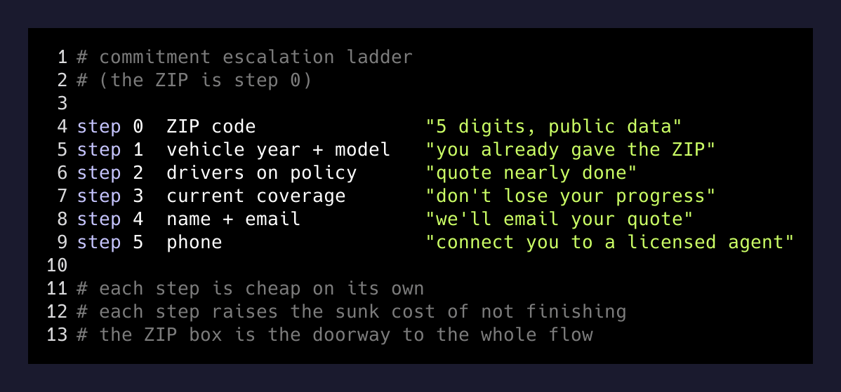
Every one of them is doing the same thing: they replaced one long form with a sequence of small screens where each screen has one visible decision. This is called progressive disclosure, but the honest name for it is commitment escalation. Every time you answer the little question in front of you, the sunk cost of not finishing the quote gets slightly higher. By the time you reach the vehicle year, you have already invested three minutes. You will finish the flow.
The ZIP-first pattern is the doorway to that escalation. It is the cheapest possible commitment that unlocks the most expensive commitment path.
Why the corporate sites and the agent microsites both do it
Some of these carriers run a two-layer model — a national brand site and a network of local agents with their own small microsites. If you assume the microsites would be scrappier, more form-heavy, more “call our office at 512-,” you would be wrong. They do the same ZIP-first pattern, often word for word.
That’s because the pattern was not invented at the corporate marketing team. It was A/B tested into existence across billions of dollars of paid traffic over roughly two decades. The insurance industry spends more on Google than any other vertical in America. When the same visual pattern shows up on twenty homepages, it is not fashion. It is the survivor of every other pattern that lost.
The microsites inherit it because their traffic sources are the same — Google, Meta, comparison sites — and the winning pattern for that traffic is settled science.
The exceptions prove it
There are two interesting exceptions.
USAA does not lead with a ZIP box, because their entire acquisition model is different: they gate on military affiliation, not price shopping. Their homepage sells the club, not the quote.
Root historically asked for a phone number first, because their thesis was that the quote had to happen inside their app, where their telematics engine could rate you on how you actually drive. The whole pitch was that a ZIP is a bad predictor and a phone is a bridge to a better one. Even they have since put a ZIP field on the homepage as a hedge.
The exceptions are companies making a strategic decision to route around the pattern, and both of them pay for it in conversion rate. They compensate elsewhere — USAA with lifetime value, Root with a different rate model.
The lesson if you are not selling insurance
If your business runs on lead capture — home services, legal, medical, education, financial — the useful question is not “how do I copy insurance sites.” It is: what is the smallest thing my prospect can hand me that lets me do something impressive next?
| Vertical | Smallest-commit first field | What it unlocks |
|---|---|---|
| Auto insurance | ZIP code | Regional quote range + carrier list |
| Home services | ZIP code | Local techs and availability today |
| Solar | Monthly bill amount | Savings estimate |
| Mortgage refi | Home value or ZIP | Rate table by state |
| Medicare supp | ZIP + birth year | Plan availability grid |
| Personal injury | Type of accident | Case-fit self-select |
Notice the shape. The first field is never the qualifying question you actually need. It is the field that lets you appear to qualify them, so the rest of the form feels earned.
What most operators get wrong
Two things.
The first is asking too much on the first screen. If your ZIP box is next to a “full name” and a “phone” and an “email” and a checkbox, you have already lost. You are trying to skip the escalation ladder and it will cost you a third of the conversions.
The second is not delivering on the second screen. If the visitor hands you a ZIP and the next thing they see is a generic form that could have been the first screen, they will bounce. The whole trick is that the ZIP earns them a piece of specific content — a carrier list for their state, a local tech’s photo, a real dollar range. If your second screen isn’t personalized, don’t use this pattern. Just show the form.
The bigger insight
You already know how to conduct this research. Open ten homepages in your vertical. Do not read the words. Look at the first form field. If it’s the same field on every site, that field is not a UX choice. That field is a moat built out of A/B tests, and the people running the site probably don’t even know why it’s there anymore. They just know that when they tried to remove it, the number went down.
The whole design of a high-intent landing page is stacked commitments. What’s the smallest thing you can ask for that still lets you personalize? That’s your first field.
For insurance, it’s five digits. For everyone else, the answer is out there in ten open tabs.