Most kickoff meetings with a design team are a slow leak of information. You answer the questions they remember to ask. They guess at the rest. Two weeks in, the homepage hero says “Empower your business with seamless solutions” and you realize nobody on the other end knows what you actually sell.
I had a designer about to start on Freebo’s marketing site. Instead of scheduling a kickoff, I compiled one document that contained every answer they were going to need — brand voice, target operator, what each page is supposed to do, the exact color tokens, the competitive frame, even the SEO metadata. One Claude Code session. 400 lines. Handed it over, opened a Loom, said “read this, then we’ll talk.”
This post is the spine of that doc and why I’d write it in that order again.
What goes in, in what order
The mistake most briefs make is leading with deliverables — “we need a homepage, a pricing page, an about page” — before establishing who the page is for and what it’s allowed to sound like. By the time the designer hits the page section they’ve already absorbed the wrong frame.
Here’s the order that worked:
Steps 1–4 are the prime. If a designer skips the rest of the doc and only reads those four, they’ll still produce something that sounds like the brand. Steps 5–10 are the receipts.
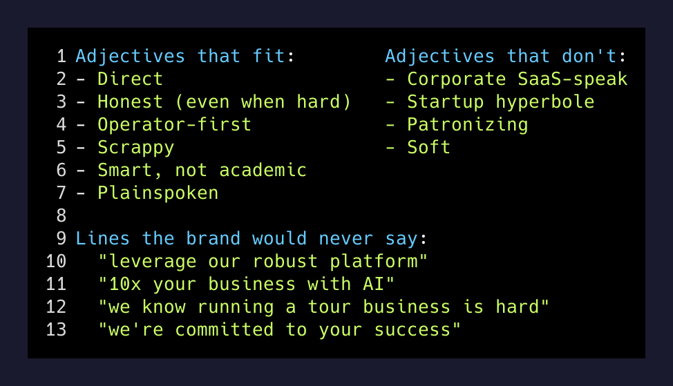
The voice section is the one nobody writes
Most briefs handle voice with a single adjective (“friendly!” “professional!”) and call it done. That’s how you get sites that sound like every other site. The voice section for Freebo had three lists:
Adjectives that fit:        Adjectives that don't:        Lines the brand would never say:
- Direct                    - Corporate SaaS-speak        - "leverage our robust platform"
- Honest (even when hard)   - Startup hyperbole           - "10x your business with AI"
- Operator-first            - Patronizing                 - "we know running a tour business is hard"
- Scrappy                   - Soft                        - "we're committed to your success"
- Smart, not academic
- Plainspoken
Negative examples do more work than positive ones. “Direct” can mean a hundred things. “Would never say leverage our robust platform” can only mean one.
The page section is a contract, not a wishlist
For every page, three things:
- Goal — one sentence. What is this page for? Not what’s on it.
- Sections — the blocks, in order, with what each one is doing.
- Copy direction — exact lines that already work, or the angle the new copy should take.
The home page entry, condensed:
Goal: Convert tour operators arriving from search, word-of-mouth, or ads. Give them enough to understand what Freebo is, believe it’s real, and take one action.
Sections: Hero → Problem statement → Product overview → Feature highlights → Social proof → Competitive comparison → Origin story → Waitlist close.
Primary CTA: “Book a demo call.” Secondary CTA: “Join the waitlist.” No self-serve signup — demos are gated.
That’s the contract. The designer can’t come back and say “we weren’t sure if you wanted a self-serve signup flow.” It says, plainly, no.
The two lists at the end
The most useful section was the shortest. Two lists, side by side:
Things to preserve from the current site:
- The voice — direct, founder-written. Don’t sanitize.
- The orange. Don’t swap for a safer blue.
- The restraint. Minimal, type-forward. No clip art, no generic SaaS illustrations.
- Dark mode as first-class, not afterthought.
- The “Book a demo call” CTA. It’s the conversion mechanism. Keep it prominent.
Things to improve:
- Explain the product. Current site teaches philosophy, not features.
- Show the product. No screenshots exist anywhere on the site.
- Social proof. Even one operator quote.
- Pricing transparency. Nowhere does it say what Freebo costs.
This is the section that prevents both failure modes — the designer who guts everything that was working, and the designer who’s too cautious to fix what’s broken.
What this replaces
This document is what would otherwise be:
- A two-hour kickoff meeting where the designer takes notes
- Three follow-up Slack threads when those notes turn out to be incomplete
- A round of revisions when the first comp uses the wrong voice
- An awkward conversation about why the new pricing page has eight asterisks
I’d rather write 400 lines once than have all of those conversations. The doc is async. The designer reads it on their own time. The questions that come back are sharper because they’re not the obvious ones — those are already answered.
A brief that takes you two hours to write saves the design team two weeks of guessing.
— Brett Ridenour
The one prompt
If you’re trying this for your own product, the move isn’t to ask Claude to “write a marketing brief.” That gets you a generic template. The move is to point it at the artifacts that already encode your brand — the current site copy, the founder manifesto, the pricing logic, a few competitor pages you respect — and ask it to synthesize a brief in the structure above.
The output is yours. The structure is what makes it usable.
Hand it over before the kickoff. Watch the kickoff get a lot shorter.